
Build beautiful, complex layouts without touching a line of code.
Text and media are essential, but design blocks are where Gutenberg truly shines. These blocks let you create buttons, multi‑column layouts, nested groups, flexible stacks, and visual separators – all with a few clicks.
In this guide, I’ll cover every design block:
- Buttons
- Columns
- Group
- Row
- Stack
- Spacer
- Separator
- Page Break
By the end, you’ll be able to build professional page layouts entirely within the WordPress editor.
r.”
1. Buttons Block – Calls to Action That Stand Out
What it does: Creates one or more buttons in a row (or stack). Each button has its own link, style, and settings.
When to use: Calls to action – “Buy Now”, “Read More”, “Subscribe”, “Download”, “Contact Us”.
Adding a button:
- Add Buttons block
- Inside, a single button appears by default
- Click “Add Button” to add more (side by side)
Key settings (for the whole Buttons block):
| Setting | Options | Best practice |
|---|---|---|
| Layout | Horizontal, Vertical | Horizontal for desktop, vertical for mobile (responsive automatically) |
| Alignment | Left, center, right | Center for hero CTAs, left for inline |
| Gap | Small, Medium, Large, Custom | Space between buttons. Medium is safe. |
Key settings (for each individual button):
| Setting | Options | Best practice |
|---|---|---|
| Text | Custom label | Action‑oriented (“Get Started”, not “Click”) |
| Link | URL (internal or external) | Open external links in new tab |
| Style | Fill, Outline, Text | Fill = high emphasis, Outline = secondary |
| Size | Small, Medium, Large, Extra Large | Hero = Large, inline = Small/Medium |
| Border radius | Pixels (0–50px) | 4–8px looks modern and clickable |
| Width | Auto, Full, Custom | Auto for inline, Full for full‑width buttons |
| Icon | Optional (SVG or Dashicon) | Adds visual hint (e.g., download arrow) |
Pro tips:
- Use one primary button per section – don’t overwhelm with multiple prominent CTAs.
- Make text action‑oriented – “Download PDF” > “Click here”.
- Outline buttons are great for secondary actions (e.g., “Cancel” or “Learn More”).
- Open external links in a new tab – check the box in link settings.
Shortcut: Type /buttons.
2. Columns Block – Multi‑Column Layouts
What it does: Splits content into 2–6 side‑by‑side columns. Each column is a container that can hold any blocks (text, images, buttons, etc.).
When to use: Pricing tables, feature lists (icon + text), side‑by‑side comparisons, grid of testimonials.
Creating a columns layout:
- Add Columns block
- Choose number of columns (2–6)
- Each column appears as an empty container
- Add any blocks inside each column
Key settings:
| Setting | Options | Best practice |
|---|---|---|
| Number of columns | 2 to 6 | 2–4 for readability, 5–6 for data‑dense |
| Column widths | Drag handles or exact percentages | Equal width (%) or specify (e.g., 33/66) |
| Vertical alignment | Top, Middle, Bottom | Useful when columns have different heights |
| Gap | Small, Medium, Large, Custom | Medium for most layouts |
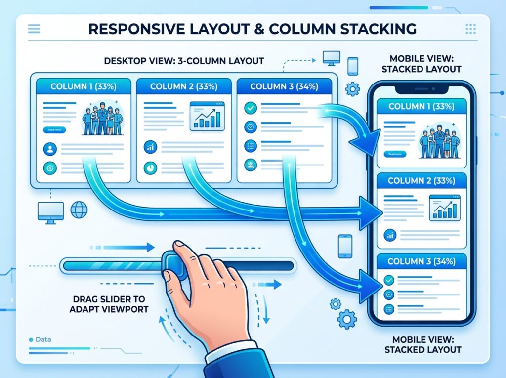
| Stack on mobile | On/Off | On (default) – columns wrap vertically on phones |
Pro tips:
- Add a background color or border to columns to separate them visually (select individual column, then Colors/Borders).
- Use Group inside a column if you need multiple blocks in that column.
- Preview on mobile – always check how columns stack. If they become too narrow, reduce number of columns.
Shortcut: Type /columns.
When to use: Section backgrounds, card designs, hero sections, any time you need to apply styling to a collection of blocks.
Creating a group:
- Select multiple adjacent blocks
- Click the block toolbar’s “group” icon (or type
/group) - Or add empty Group block and drag other blocks inside
Key settings:
| Setting | Options | Best practice |
|---|---|---|
| Background | Color, Gradient, Image | Use sparingly – keep content readable |
| Padding | None, Small, Medium, Large, Custom | Essential for spacing inside group |
| Margin | None, Small, Medium, Large, Custom | Space outside the group |
| Border | Width, color, radius | Subtle borders for card effects |
| Text color | Override for all text inside | Ensure contrast with background |
| Layout | Flow, Flex, Grid | Advanced – usually leave as Flow |
Pro tips:
- Use Group instead of adding background to individual blocks – cleaner, faster.
- Nested groups allow complex designs (e.g., Group inside a Column inside a Columns block).
- Set a background image on group for section‑wide banners.
Shortcut: Select blocks → click three dots → “Group”. Or /group.
4. Row Block – Horizontal Arrangement (Flex Layout)
What it does: Similar to Columns but with more control. Row lets you arrange blocks horizontally and control alignment, wrap, and direction at a finer level.
When to use: Navigation bars, icon row (social icons), inline meta info (author, date), any horizontal arrangement that’s not a traditional grid.
Key settings:
| Setting | Options |
|---|---|
| Direction | Row (horizontal), Row reverse |
| Alignment | Space between, space around, space evenly, start, center, end |
| Wrap | On/Off – wrap to next line on mobile |
| Gap | Horizontal and vertical spacing |
| Item width | Auto or fixed |
Row vs Columns:
- Columns = grid layout with equal or predefined column widths. Best for text-heavy.
- Row = flex‑based, items shrink/grow naturally. Best for icons, badges, tags.
Shortcut: Type /row.
5. Stack Block – Vertical Arrangement with Features
What it does: Arranges blocks vertically with spacing controls. Similar to Group but specialized for vertical rhythm.
When to use: Sections that need consistent spacing between elements (headline → paragraph → button stacks).
Key settings:
| Setting | Options |
|---|---|
| Spacing | Custom gap between child blocks |
| Alignment | Left, center, right |
| Background, padding, border | Like Group block |
Stack is essentially a Group block with vertical spacing preset. Use it when you don’t need the extra flexibility of Group.
Shortcut: Type /stack.
6. Spacer Block – Add Empty Space
What it does: Inserts a custom amount of blank space between blocks.
When to use: When you need more space than theme defaults provide – before a heading, after a section, separating elements.
Key settings:
| Setting | Options |
|---|---|
| Height | Pixels (e.g., 20px, 50px, 100px) |
| Responsive | Can set different heights for desktop/tablet/mobile |
Pro tips:
- Avoid overusing Spacer – excessive empty space hurts usability. Trust the theme’s margin defaults.
- Use Group margin/padding instead where possible – more semantic.
- Set height small (20–40px) for subtle separation.
Shortcut: Type /spacer.
7. Separator Block – Horizontal Line
What it does: Draws a horizontal line (HR) to visually separate content.
When to use: Between sections, before a conclusion, to break up long articles.
Key settings:
| Setting | Options |
|---|---|
| Style | Line (default), Dots (text dividers), Wide line |
| Color | Choose from palette |
| Width | Default, Full, Custom (percentage) |
| Height | Thickness in pixels |
Pro tips:
- Use dots style for light visual separation (e.g., between tips).
- Keep consistent – don’t mix multiple separator styles on same site.
- Wide line with accent color makes a strong break.
Shortcut: Type /separator.
8. Page Break Block – Split Content Across Pages
What it does: Inserts a pagination break inside a post or page. Splits long content into multiple pages.
When to use: Extremely long articles (10,000+ words) to reduce scrolling, or multi‑page guides.
How it works:
- Add Page Break block where you want first page to end.
- On frontend, visitors see “Page 1 of 3” with next/previous navigation.
- Each page loads separately (new URL with
/2/,/3/).
Key settings:
None – just insert and the break happens.
Pro tip:
Use rarely – pagination breaks can hurt user experience for mobile readers. Consider a Table of Contents block instead.
Shortcut: Type /page-break.
Comparison Table: Which Design Block Should You Use?
| Block | Best for | When to use |
|---|---|---|
| Buttons | Call to action | One or multiple action links |
| Columns | Grid layouts, side‑by‑side text | Feature lists, pricing tables |
| Group | Styled section container | Adding background/padding to a group of blocks |
| Row | Horizontal arrangement, icons | Icon rows, tag lists, meta info |
| Stack | Vertical rhythm | Consistent spacing between vertical items |
| Spacer | Manual empty space | When theme margins aren’t enough |
| Separator | Visual division | Between long sections |
| Page Break | Pagination | Extremely long articles (rare) |
Common Mistakes to Avoid
- Too many columns on mobile – 4+ columns become unreadable. Use 2–3 columns max or let them stack.
- No background contrast in Groups – if you add a background color, ensure text contrasts (check with WebAIM contrast checker).
- Overusing Spacers – leads to inconsistent vertical rhythm. Let margins do the work.
- Missing button link – always test buttons before publishing.
- Ignoring responsive preview – always check columns, groups, and stacks on mobile view.
Pro Layout Workflow with Design Blocks
Here’s how I build a typical page using these blocks:
- Add a Group – set background color, padding, and margin for the whole section.
- Inside Group, add Columns block (2 columns).
- Left column – add Heading + Paragraph text.
- Right column – add Image block.
- Below Columns, add Buttons block – one primary CTA.
- Between sections, add Separator (dots style) or Spacer.
- Repeat for multiple sections.
No code, no page builder – pure Gutenberg.
What’s Next?
You now control layout and design. Next, we’ll cover Widget Blocks – Shortcode, Archives, Calendar, Categories, Latest Posts, Latest Comments, Search, Social Icons, Tag Cloud, RSS.
👉 Next article in this series: Gutenberg Widget Blocks – Shortcode, Archives, Latest Posts, Search, Social Icons & More
Which design block surprised you most? Any questions about columns vs row vs stack? Ask below.
📌 Key Takeaways (for skimmers)
- 8 design blocks – Buttons, Columns, Group, Row, Stack, Spacer, Separator, Page Break.
- Buttons = call to action. Use fill + outline style, action text.
- Columns = multi‑column layouts. Always preview mobile stacking.
- Group = container for several blocks (background, padding, border).
- Row = horizontal flex layout (icons, social links).
- Stack = vertical spacing container.
- Spacer = manual empty space (use sparingly).
- Separator = horizontal line (dots style for subtle breaks).
🔗 Internal Links
- Article #1 – Gutenberg & Blocks: Why This Is the New Standard
- Article #2 – Text Blocks Complete Guide
- Article #3 – Media Blocks Complete Guide
- Article #5 – Widget Blocks (coming soon)